Design 7 - March 2009 to current
..........................................
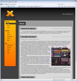
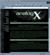
This redesign was definitely the largest undertaking, with basically every aspect of the site being overhauled. The focus was to use as much of the newer tech that finally was mainstream as possible such as CSS, XHTML, AJAX/AJAH, etc. The design this time was actually done by several people and I combined their work, tweaked it and finally converted it from a PSD into something meant for the web.
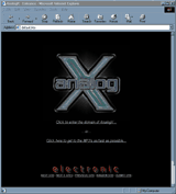
The site actually trimmed down a bit in this conversion, since I descided to just remove some portions that were no longer relevant. I also removed the AnalogX ListServer Legion, which is a bummer but let's face it, I haven't sent out a ListServer message in years. This revision also marked the end of the entry page - I was probably one of the last sites on the net to be using one of these. ;)
Design 6 - May 2003 to March 2009
..........................................
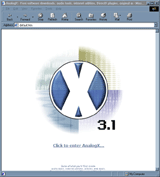
If the last design was technically 5.0, then this would have to be 5.1 - even though that the number I picked is actually 3.1! :) Once again the refinement was done my the design master himself, Jeff Churchill who took time away from his busy schedule as a soon to be rock star, which I definitely appreciate.
Navigation is back where it belongs, on the site and fully expanded so you can get from wherever you are, to wherever you want to be in one click regardless of where you're at. The sidebar graphic is just the waveform, since it was the coolest of the sidebars.
Design 5 - December 2001 to May 2003
..........................................
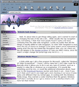
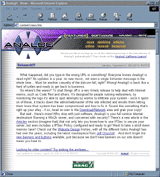
I guess technically this design should have been 5.0, it really felt like the third major design change. This design is the first one that I didn't do, and it shows! :) Jeff Churchill , the same person who designed the shirts for the contest created this, following the same sort of techno theme.
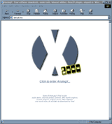
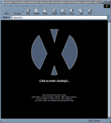
Navigation underwent a pretty major transition, from the one nav bar on the left side which was pretty consistent through all my designs to a sectioned approach, with four distinct areas. Each area has its own sidebar graphic down the right side, which happens to be the four different graphics layered behind the X logo on the entry to the site.
This also marked the relaunch of the site after a little over a year of neglect, so it was nice to have something new and hip to get things off on the right foot.
Design 4 - January 2000 to December 2001
..........................................
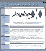
New year, new web design! This is the most profound change that I really made, and it incorporated quite a bit of work to make it happen (redoing screenshots, graphics, etc). In a website review I got slammed for having a black background, and upon serious reflection on the subject I felt they had a very valid point. I also felt that the site had too 'hard' a feel graphically before, so I went for the whole softer/kinder side. Overall this is definitely the most well-known look for AnalogX and also represents the limit of my design skill, heck, some people even ripped off the look (which I love)! :)
Navigation changed pretty dramatically, showing once again the impact of the software on the site as a whole - at this point there was not only enough software for its own category, but for several sub-categories as well.
Design 3 - October 1999 to January 2000
..........................................
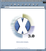
After receiving numerous complaints about the site being hard to read, I finally decided it was time for a bit more major an overhaul. Since I'm not a terribly creative graphic designer, that translated to a color change... Hmmm, green to blue perhaps? This also marks the first appearance on the website of the infamous X logo - I have to say that I always really liked this particular design.
New to the site at this time was the About section, which I decided to add after getting a couple of emails from various people complaining about the lack of any personal detail (the prior About section was really just the history of the band). I also started writing software specifically for the website (such as CGISearch) to help bolster its usability.
Design 2 - June 1999 to October 1999
..........................................
Really more of a refinement than anything else, but this marked a couple of fairly major events in AnalogX history. First, frames went bye bye; next, the listserver was born - I can still remember the first user signing up, it was so exciting. I used to log into the server each day to see how many people signed up, "Wow! Two new users in one day!".
The software side of the site also started taking a more predominant role in what the site was all about - as indicated by its meteoric rise from Resources to Features. At this point the music was also doing far better on MP3.com , around this time I also finally made it to #1 in one of the genres - very cool.
Design 1 - October 1998 to June 1999
..........................................
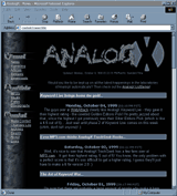
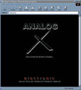
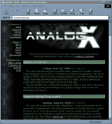
Ahh, everything has to start somewhere, and this is when the timeline for AnalogX started... It was a dark and stormy night, ok, so it wasn't stormy (it is Arizona after all), but it was definitely night. This was really the first phase (imagine that) of the website, when it focused almost exclusively on the music side of things. If you take a look at the menu, you can even see this is prior to the software even really happening - its relegated to the resources section.
While I liked this design, it had a couple things that really bothered me, the worst of which was that it used frames which at the time didn't work correctly in a few browsers and search engines did a full stop on.
Last updated on Tuesday, March 9, 2021 12:24:38 PM PST. AnalogX trade is a registered trademark of AnalogX, LLC. All other trademarks are the sole property of their respective owners. All contents copyright ©1998-2009, AnalogX. All rights reserved.


